Redesigning My Portfolio with Nitro-Inspired UI
Redesigning My Portfolio with Nitro-Inspired UI
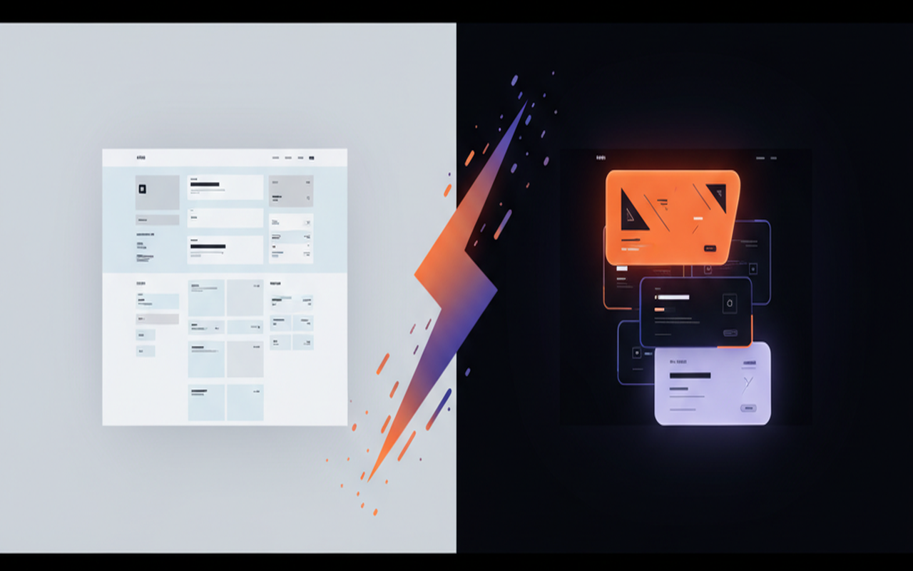
I've been shipping projects and writing blog posts for months, but the site itself was starting to feel... generic. Clean, sure. Functional, yes. But it didn't have personality. Then I came across the Nitro Framer template and everything clicked.
This post documents how I redesigned my entire portfolio in a single session — the design decisions, the CSS tricks, the animation math, and the iterative debugging that turned a standard dark-mode portfolio into something with real visual identity.
The Inspiration
Nitro nails a few things that most portfolio templates get wrong:
- Scroll-stacking project cards — cards stack on top of each other like a deck as you scroll, each with a bold color theme
- Cinematic restraint — dark, moody, with film grain and subtle blur effects
- Typography as personality — uppercase titles, mono metadata, generous whitespace
- Minimal chrome — transparent navbar, no gradient buttons, no decorative noise
I didn't want to clone Nitro. I wanted to extract the principles and apply them to my existing Next.js + Tailwind stack.
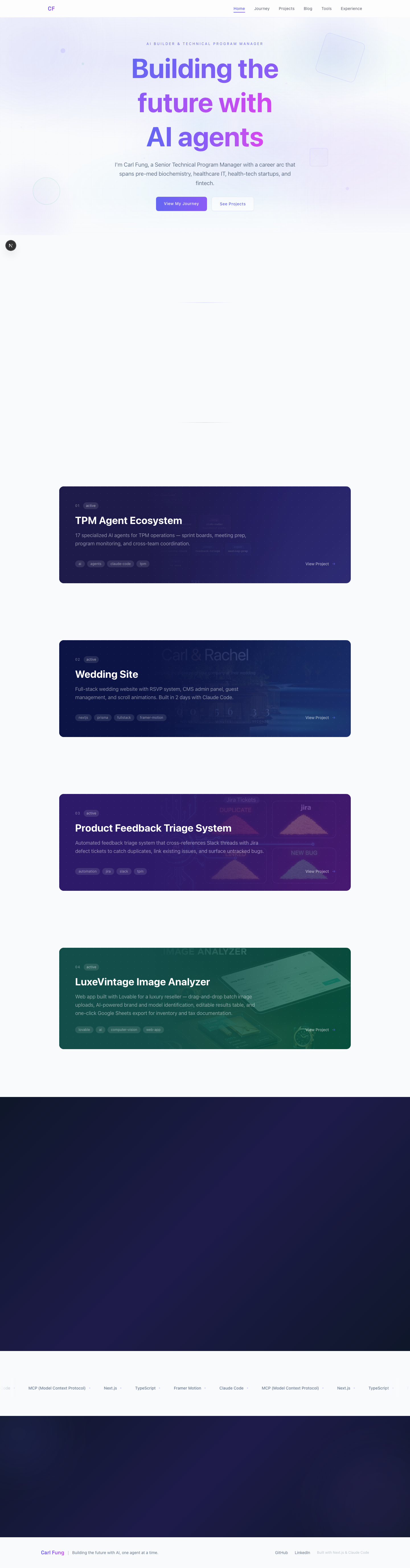
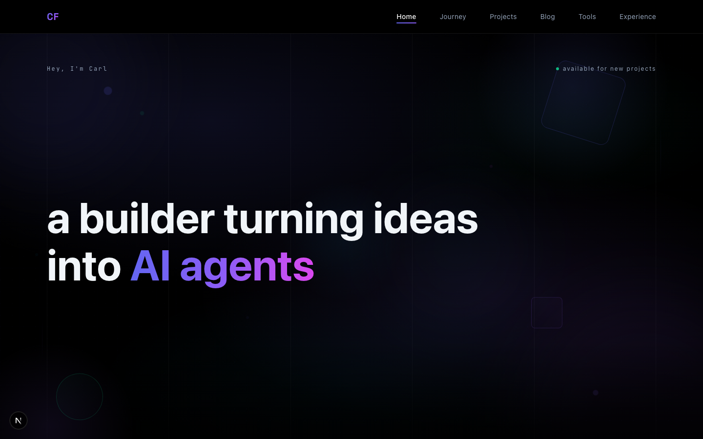
Before & After
The transformation speaks for itself:
Before — gradient hero, standard card layout, light/dark hybrid:
After — dark, moody, cinematic, with scroll-stacking cards:
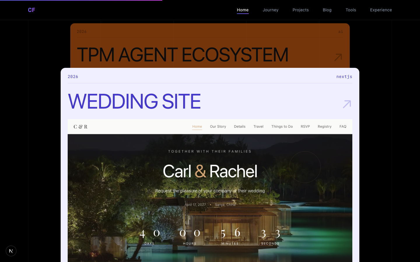
The Scroll-Stacking Cards
This was the centerpiece. In Nitro, project cards stack on top of each other as you scroll — the current card stays sticky while the next one slides up from below, creating a deck-of-cards effect.
The Math
Getting the timing right was the hardest part. Three variables control the feel:
container height = how long each card stays visible
negative margin = how much containers overlap
solo time = height + margin = how long before next card appears
I went through several iterations:
| Height | Margin | Solo Time | Result |
|---|---|---|---|
| 150vh | -55vh | 95vh | Too much gap — dead space between cards |
| 115vh | -75vh | 40vh | Too tight — cards covered before fully visible |
| 130vh | -60vh | 70vh | Still too much gap |
| 160vh | -85vh | 75vh | Just right — full card visible, tight transitions |
The Animation
Each card uses Framer Motion's useScroll and useTransform to track scroll progress:
const scale = useTransform(
  scrollYProgress,
  [0, 0.2, 0.45],
  isLast ? [1, 1, 1] : [1, 1, 0.85]
);
const contentOpacity = useTransform(
  scrollYProgress,
  [0, 0.15, 0.4],
  isLast ? [1, 1, 1] : [1, 1, 0.15]
);
The key insight: previous cards fade to 0.15 opacity (not zero) and scale to 0.85 — they become ghost strips at the top, creating the stacked deck visual. Each card gets a 14px sticky offset so the strips are visible but compact.
Coordinated Color Themes
Each card gets a coordinated color palette — background, text, metadata, divider, and arrow colors that all match:
const themes = [
  { bg: "#F97316", text: "#1A1A1A", meta: "rgba(0,0,0,0.45)" },
  { bg: "#EFEFFF", text: "#4338CA", meta: "#4338CA" },
  { bg: "#1E1E1E", text: "#86EFAC", meta: "rgba(134,239,172,0.5)" },
  { bg: "#FACC15", text: "#1A1A1A", meta: "rgba(0,0,0,0.45)" },
];
Cinematic Portrait Treatment
Nitro uses film grain overlays on images. I applied this to my about section portrait with a layered approach:
- Dim + desaturate the base image:
brightness-75 saturate-[0.6] - Gradient overlays on all four edges for a vignette effect
- Animated film grain using a noise PNG texture:
@keyframes grain {
  0%, 100% { transform: translate(0, 0); }
  10% { transform: translate(-5%, -10%); }
  30% { transform: translate(7%, -25%); }
}

.grain-overlay::after {
  background-image: url("/images/noise.png");
  opacity: 0.2;
  mix-blend-mode: overlay;
  animation: grain 4s steps(8) infinite;
}
The steps(8) timing function is crucial — it creates a film-like stutter rather than smooth interpolation.
Transparent Navbar
A small change with big impact. The navbar went from solid black to:
background-color: rgba(0, 0, 0, 0.6);
backdrop-filter: blur(12px);
border-bottom: 1px solid rgba(255, 255, 255, 0.08);
Now the hero gradient and content bleeds through the nav, creating depth. The subtle border provides structure without heaviness.
Blog Page: Editorial Numbers & Image Fades
Each blog post gets a large editorial number — a gradient-filled numeral that fades from indigo to transparent:
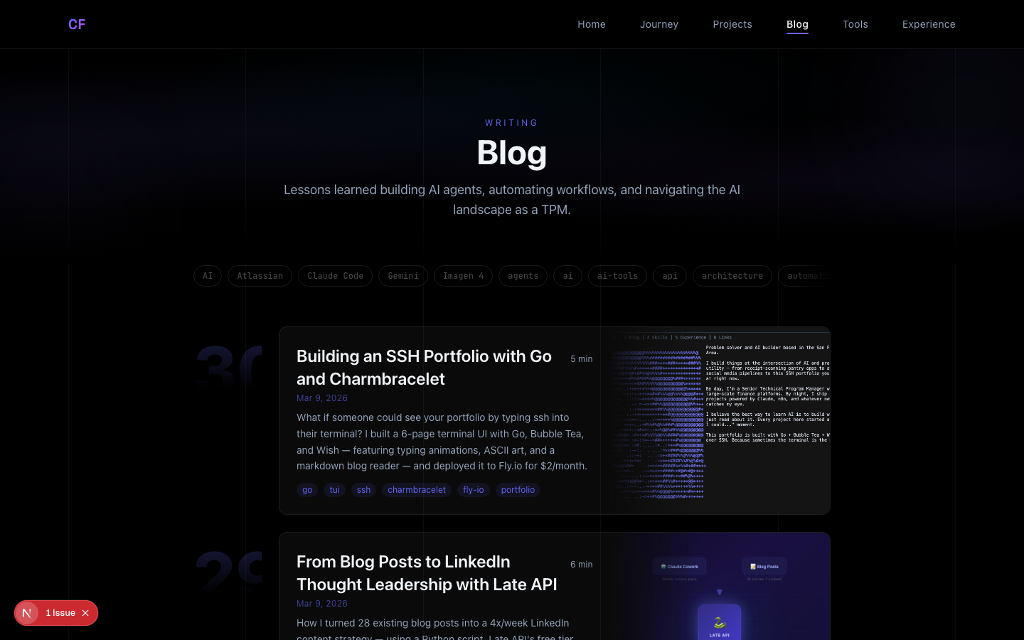
.post-number {
  font-size: 2.5rem; /* scales to 6rem on desktop */
  font-weight: 800;
  background: linear-gradient(180deg, rgba(99,102,241,0.25) 0%, transparent 80%);
  -webkit-background-clip: text;
  -webkit-text-fill-color: transparent;
}
The blog thumbnails use CSS mask-image to fade into the card:
mask-image: linear-gradient(to right, transparent 0%, black 40%);
This creates a seamless blend between the text content and the hero image — no hard edges.
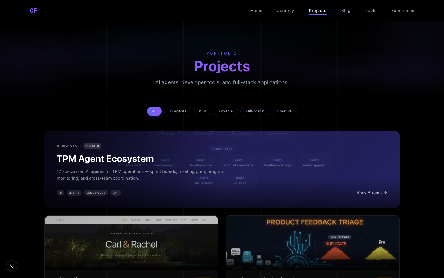
Projects Grid
The projects page got upgraded too — the hero card now uses real project screenshots with gradient overlays instead of emoji placeholders:
Vertical Grid Lines
A subtle but effective touch — six vertical lines at 4% opacity span the entire page:
<div className="fixed inset-0 z-0 pointer-events-none">
  <div className="mx-8 md:mx-16 lg:mx-24 h-full flex justify-between">
    {[...Array(6)].map((_, i) => (
      <div key={i} className="w-px h-full bg-white/[0.04]" />
    ))}
  </div>
</div>
They match the page's horizontal padding, creating an invisible grid that makes everything feel intentionally placed.
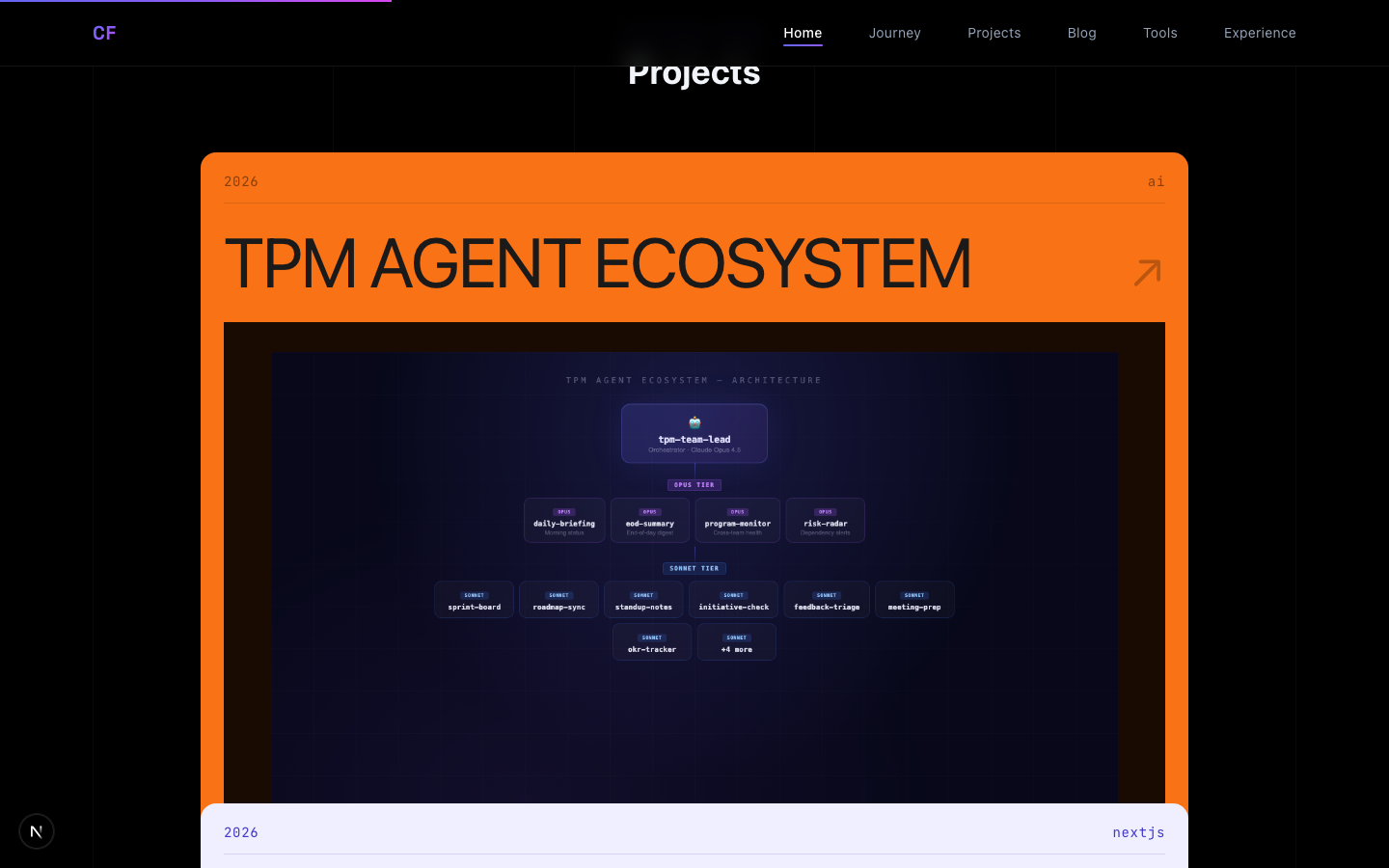
AI-Generated Project Images
Some projects don't have a live UI to screenshot (like the TPM Agent Ecosystem). For these, I used two approaches:
- HTML diagrams — render an architecture diagram as styled HTML, then screenshot with
agent-browser - AI generation — use Gemini 2.5 Flash Image to generate hero images
Key lesson: avoid text in AI image prompts. My first LuxeVintage hero image had garbled text on every UI element. The fix was prompting for "no text anywhere" and letting the visual composition speak for itself.
Redesigned Footer
The footer went from a gradient-heavy design to a minimal mono aesthetic:
Mono font, subtle colors, matching the page's horizontal padding. No icons, no gradients — just information.
Mobile Debugging
Two issues caught me after the initial deploy:
- Portrait cutoff — the two-column grid stacks on mobile, but
min-h-[280px]was too short andbg-topshowed the top of my head instead of my face. Fix:min-h-[400px]+bg-[center_20%] - Editorial numbers clipped —
4remnumbers in aw-10column overflowed. Fix: responsive widthsw-12 sm:w-20 md:w-24with2.5rembase scaling to6rem
What I Learned
- Reference designs are gold — having Nitro as a north star made every decision faster
- The math matters — scroll-stacking required precise tuning of container heights, overlaps, and animation curves across 6+ iterations
- Restraint is design — removing gradient buttons, heavy shadows, and decorative elements made the site feel more premium
- CSS can do a lot — film grain, mask-image fades, backdrop blur, gradient text — no JS needed for most visual effects
- Mobile is a different design — every section needed explicit mobile treatment
The entire redesign happened in one session with Claude Code handling the implementation. The iterative loop — screenshot, feedback, adjust, screenshot — made it possible to converge on the right feel quickly.
The site is live at ai-journey-ten.vercel.app. The pre-redesign version is preserved as git tag v1.0-pre-nitro-redesign if you want to compare.