Visualizing Your AI Journey: Infographics as a Learning Tool
Visualizing Your AI Journey: Infographics as a Learning Tool

At the end of each week, I write a timeline document summarizing what I built, what broke, and what I learned. Then I turn it into a visual infographic using Napkin AI.
This isn't vanity — it's the single most effective reflection habit I've developed. Here's why and how.
Why Visualize?
Building AI agents is fast. Too fast. In one week I went from zero to 17 agents, 35 skills, and an orchestrator pattern. Without deliberate reflection, the lessons blur together.
Writing a timeline helps. But converting that timeline into a structured infographic prompt forces a different kind of thinking:
- What are the real milestones? Not every change is worth a node on the timeline.
- What are the actual numbers? Growth curves, cost trends, and session counts don't lie.
- What's the narrative arc? Foundation → Expansion → Breaking → Hardening → Optimization.
The act of structuring data for visual consumption surfaces insights that prose alone misses.
The Workflow
Step 1: Write the Weekly Timeline
At the end of the week, I ask Claude Code to generate a timeline document from the session history — what agents were built, what bugs were fixed, what architectural decisions were made. This becomes a markdown file with day-by-day entries.
Step 2: Generate the Infographic Prompt
From the timeline, I create a structured prompt designed for Napkin AI. The prompt has specific sections:
- Hero Banner — Title, subtitle, date range
- 8-Day Timeline — Horizontal nodes with milestone labels and color coding
- Growth Chart — Three lines: agents, skills, reports generated
- Cost Chart — Daily spend bars with session counts
- Key Stats — Bottom row of metric cards
- Architecture Evolution — Before vs. after diagram
- Lessons Learned — Three callout boxes
Step 3: Feed to Napkin AI
Napkin AI (I call it "nanobanana") is a Gemini-powered tool that auto-generates visual layouts from structured text. You don't need to specify CSS or styling — just clean markdown with clear section breaks.
The key is giving it explicit visual direction:
### Visual Style Notes
- Dark mode background (#0D1117)
- GitHub-inspired accent colors: Blue #58A6FF, Green #3FB950,
  Yellow #D29922, Red #F97583, Purple #BC8CFF, Orange #FFA657
- Monospace font throughout
- Minimal borders, generous whitespace
- Subtle glow effects on key numbers
- No gradients — flat design with transparency
- Professional, engineering-focused aesthetic
- Aspect ratio: 16:9 landscape
The Result
Here's what Week 1 looked like:
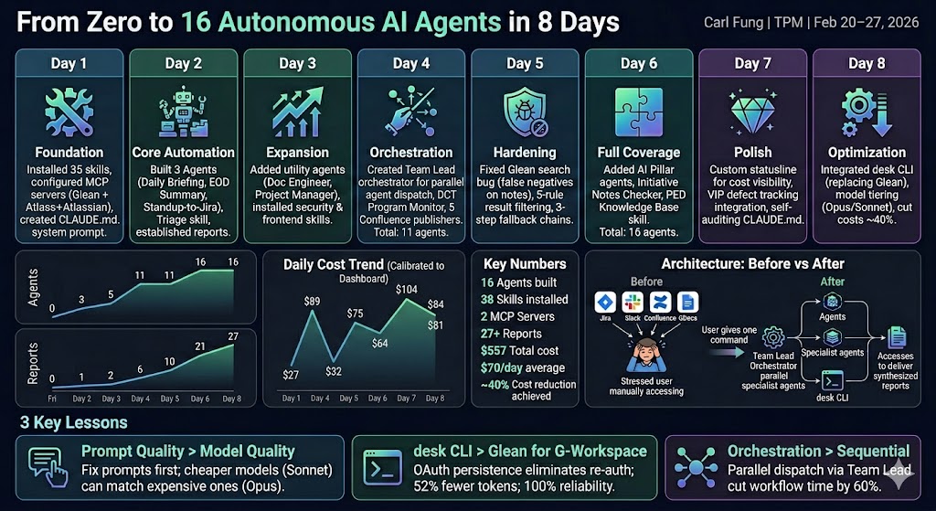
The infographic captures the entire journey in one glance: the 8-day timeline across the top, cumulative growth curves on the left, daily cost bars on the right, and key metrics along the bottom.
The Full Prompt (Sanitized)
Here's the actual prompt I fed to Napkin AI, so you can adapt it for your own projects:
# Claude Code Evolution — Week 1

## From zero to 16 autonomous AI agents in 8 days

---

## The 8-Day Journey

Day 1 — Foundation: Installed 35 skills, configured MCP servers,
  created CLAUDE.md system prompt

Day 2 — Core Automation: Built first 3 agents (Daily Briefing,
  EOD Summary, Standup-to-Jira), created triage skill,
  established report output system

Day 3 — Expansion: Added utility agents (Documentation Engineer,
  Project Manager), installed security and frontend skills

Day 4 — Orchestration: Created Team Lead orchestrator for parallel
  agent dispatch, program monitor, 5 Confluence publishers.
  Total: 11 agents

Day 5 — Hardening: Fixed critical search reliability bug causing
  false negatives, added 5-rule result filtering and 3-step
  fallback chains

Day 6 — Full Coverage: Added pillar monitoring agents, initiative
  notes checker, knowledge base skill. Total: 16 agents

Day 7 — Polish: Custom statusline for cost visibility, VIP defect
  tracking integration, self-auditing config review skill

Day 8 — Optimization: Integrated CLI tools replacing middleware
  for Google Workspace, implemented model tiering (Opus/Sonnet),
  cut costs ~40%

---

## Growth Over 8 Days

Agents: 0 → 3 → 5 → 11 → 11 → 16 → 16 → 16
Skills: 29 → 33 → 35 → 35 → 35 → 36 → 38 → 38
Reports Generated: 0 → 1 → 2 → 6 → 10 → 17 → 21 → 27

---

## Key Numbers

- 16 Agents built
- 38 Skills installed
- 2 MCP Servers configured
- 8 CLI Tools integrated
- 27+ Reports generated
- 86 Sessions logged
- ~40% Cost reduction achieved via optimizations

---

## 3 Key Lessons

1. Prompt quality beats model quality — fix the prompt first
2. Direct CLI tools beat middleware — OAuth refresh tokens
   eliminate hourly re-auth, 52% fewer tokens
3. Orchestration beats sequential — parallel agent dispatch
   cut compound workflow time by 60%
Why This Matters
The infographic isn't the point. The process is:
- Collect data — session logs, cost dashboards, agent counts
- Structure it — timeline, growth curves, key metrics
- Narrate it — what's the story arc, where are the inflection points
- Visualize it — feed to Napkin AI for a shareable artifact
This cycle forces you to ask: What did I actually accomplish? What cost me the most? What would I do differently?
After doing this for just one week, the insights were immediate:
- Day 6 was the most expensive day because I built two complex agents simultaneously — next time, I'd stagger them
- The growth curve flatlined after Day 6, meaning the remaining days were optimization, not expansion
- Session count dropped from 21 on Day 7 to 2 on Day 8 — proof that session consolidation works
Key Takeaways
- Visual reflection surfaces insights that prose misses — when you have to plot a cost curve, the anomalies become obvious
- Structured prompts produce better infographics — give Napkin AI explicit sections, colors, and chart types
- Make it a weekly habit — the compound effect of weekly reflection is enormous
- Share the artifact — infographics are shareable in ways that timeline docs aren't
- The prompt is reusable — once you have a template, future weeks take minutes, not hours